6 Mistakes to Avoid When Designing Your CTAs

Alex Jasin
December 11, 2023
Discover the key pitfalls to steer clear of when crafting compelling Call-to-Action (CTA) buttons. Uncover the six common mistakes that can hinder your CTA effectiveness and learn how to optimize your design for better user engagement.
 Picture this: You have worked really hard in creating a compelling website and writing top-notch content but still found your conversion rates lagging. The reason might be your CTAs.
CTAs might seem like a small element to you, but they can make or break your conversion efforts. A well-placed, well-worded CTA can be the bridge between a visitor and a customer on your website. Without it, you might just be missing out on countless conversions.
Today, in this article, we will explore the most common mistakes in CTA design and learn how to make them truly work for you.
Mistake #1: Not Understanding Your Audience
Understanding your audience is the cornerstone of any marketing or go-to market strategy, and CTAs are no exception. The message you convey through your CTA can be the deciding factor between a bounce and a conversion.
Broad, generic CTAs like "Click Here" or ‘Learn More’ don't provide any context or reason for the user to take action. On the other hand, a more effective and audience-tailored CTA clearly conveys the value or benefit to the user, such as "Get Your Free E-book Now" or "Start Your 30-Day Trial." According to a study by HubSpot also, personalized CTAs performed 202% better than default versions.
Source: HubSpot
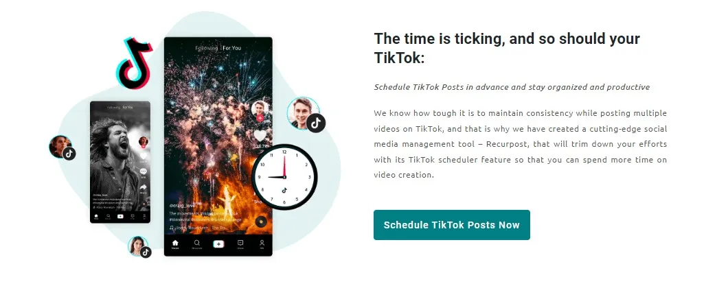
Consider the Recurpost, a content scheduling website example below. The platform managed to increase its conversion rate from 10% to 25% simply by tweaking its webpage CTA from ‘Scheduled Posts’ to ‘Schedule TikTok Posts Now’.
Source: Recurpost
The modified CTA also clearly shows users that Recurpost supports TikTok scheduling, which might not have been obvious with the generic 'Scheduled Posts'. This clarity can reduce bounce rates as visitors quickly understand the platform's capabilities.
The same reflexion goes for CTAs that are included at the bottom of your sales email. If it doesn’t fit with your audience, it might hurt your conversion rate drastically.
Mistake #2: Overlooking Visual Hierarchy
In web design, visual hierarchy determines the sequence in which our eyes perceive what they see. When it comes to CTAs, this hierarchy is important to ensure that the most vital action is also the most visually prominent.
Every aspect of a CTA, from its color to its shape, plays a role in drawing the attention of your audience. Colors, for instance, evoke emotions and drive actions. We all have intuitive associations with different colors. Just like green conveys positivity; red symbolizes urgency. This has proven highly impactful in the Performable website case.
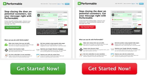
Source: HubSpot
The website once tweaked its CTA button from green to red, witnessing a striking 21% boost in conversions.
Size and prominence also dictate the CTA's noticeability. If your CTA is too large, it can be overpowering; and if it is too small, it risks going unnoticed. Thus the key is to ensure the CTA stands out without overshadowing other vital content of your webpage.
You can also use real user monitoring tools to visually monitor how your visitors are interacting with your CTAs.
Mistake #3: Poor Placement Of CTAs
CTA placement is often a balance between being unmissable but not overbearing. Many experts consider the 'above the fold' region as the best placement of a CTA. Above the fold is a part of your webpage visitors can see without scrolling. Data also suggests that content in this area captures a whopping 80% of user attention.
While 'above the fold' is a good spot, CTAs can thrive in other spots too. Sometimes, placing them at the end of an informative piece of content or introducing them as timely pop-ups can be just as, if not more, effective.
A great example of this comes from Michael Aagaard of Content Verve. His experiment of positioning a CTA at the bottom of a lengthy B2C landing page led to an astounding 304% jump in conversions!
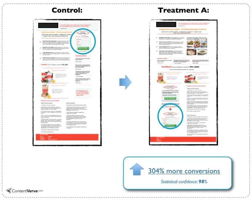
Source: CXL
But remember, a CTA that's hidden at the page's bottom, overshadowed by other design elements, is a missed opportunity. If visitors can't easily find your CTA, they won't know the action you want them to take, costing you potential conversions.
In short, while there's no one-size-fits-all approach for considering the best placement of your CTAs, understanding your audience's behavior and testing different placements can guide you to the sweet spot for your CTA.
Mistake #4: Overloading with Too Many CTAs
Having choices is good. But having too many? It's paralyzing. This phenomenon, known as "choice overload," can leave your visitors frozen when they are bombarded with too many CTAs on your website. It leaves them unable to decide and more likely to skip taking any action at all.
Your website's main objective should be clarity. It might be tempting to throw in multiple CTAs to cover all possible actions on your website, but it's better to strategically lead visitors to one primary action that aligns with your end goal.
Consider the websites of two well-known brands, for instance: Netflix and Hulu.
When you visit Netflix's homepage for the first time, it's clear what they want you to do: "Get Started" The design is minimalistic, emphasizing this primary CTA, making it easy for visitors to understand their next step.

Source: Netflix
Even if you scroll down to their landing page, they've optimized it for a singular user action: Get Started.
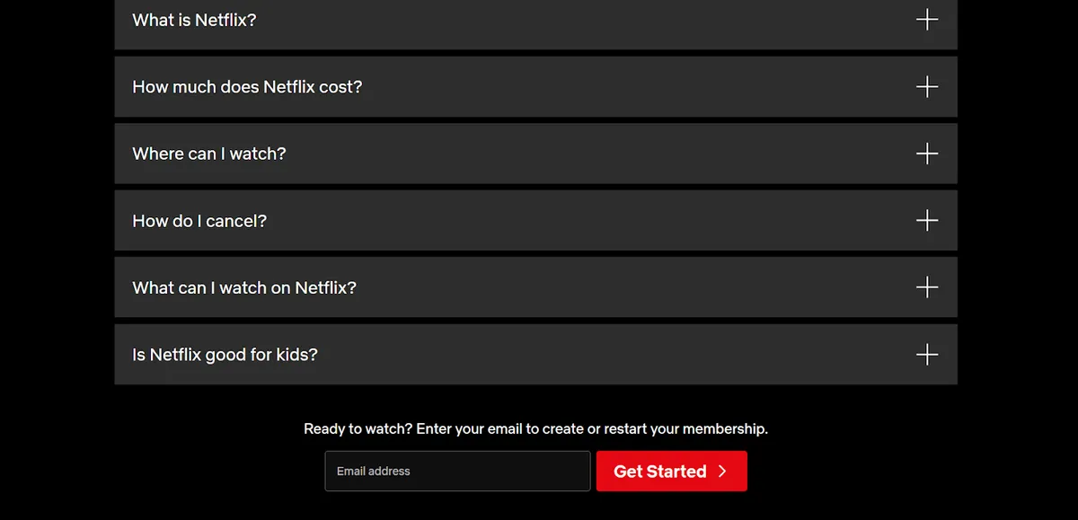
Source: Netflix
Now consider the Hulu website. Hulu offers a variety of plans, bundles, and add-ons, including their partnership with Live TV. While these offerings provide users with a choice, their homepage can be overwhelming for a first-time visitor. You're presented with multiple CTAs, like "Get Them Both," ‘’Get All Three’’, ‘’Sign Up For Hulu Only’’ or "Get Hulu + Live TV".

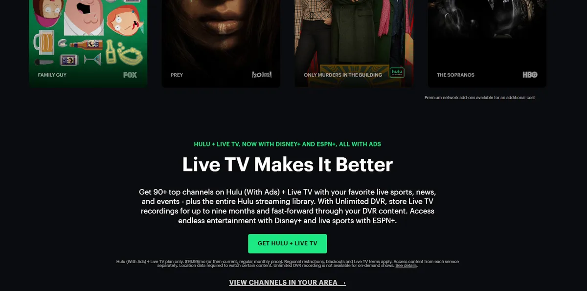
Source: Hulu
While these options cater to different user preferences, the sheer number might lead to decision paralysis for someone unsure of what they're looking for.
Thus, focus on the primary action you want your visitor to take. Less often truly is more when it comes to CTAs. Even if multiple CTAs are necessary due to business offerings, design them in a way that doesn't overwhelm the user. Lead with your primary CTA, and let secondary CTAs follow without causing confusion.
Mistake #5: Neglecting Mobile Users
In our digital age, browsing on the go has become the norm. With over 55% of web traffic now coming from smartphones, overlooking mobile optimization can spell missed opportunities.
Here's the crux: mobile users experience websites differently. The smaller screens and touch-based navigation mean that your CTAs need to be clear, tap-friendly, and positioned to avoid accidental clicks.
A responsive website design is essential. It ensures that everything, from layout to images, adjusts neatly regardless of the device being used by your visitors. And remember, speed is pivotal. Mobile users expect quick loading times, so ensure your website is up to par by compressing images and using speed-enhancing techniques.
Always test your CTAs on various devices to catch any glitches, ensuring every visitor has a smooth experience.
Mistake #6: Failing to Test and Iterate
User behaviors and preferences keep on evolving with time. And so should your CTAs. Just because a CTA worked well last year, or even last month, doesn't guarantee its efficacy today. Thus the mantra for sustained success is simple: test, learn, and iterate.
A/B testing, wherein two versions of a CTA (or any webpage element) are tested against each other to determine which performs better, is a powerful tool in this regard. It provides empirical evidence about what resonates with your audience, removing guesswork from the equation.
A/B and CTA tests should always be performed on various CTAs to determine which ones perform the best, just like Unbounce did. Unbounce had a landing page where they wanted people to pick a pricing plan and sign up. Initially, their main "Pick your plan" CTA button was at the top, which, when clicked, smoothly scrolled down to reveal the pricing options and CTAs at the page's bottom.
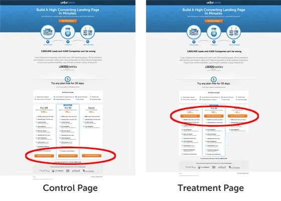
Source: Unbounce
Thinking they could do better, Unbounce tried a new layout. They moved the sign-up CTA buttons to a spot just above the pricing details, making them more visible right after users clicked the top button. This small shift in CTA led the website to a 41% boost in sign-ups compared to the original CTA design.
The Balance: Urgency vs. Pressure (Bonus Point)
A compelling CTA captures interest and directs the user towards action without using high-pressure tactics. Phrases like "Limited Offer" or "Exclusive Deal" can incite enthusiasm in the minds of users, but they should be used smartly.
The goal is to strike the right balance and always put yourself in the shoes of the user. Think of what might motivate you to act without feeling pressured. Regularly seeking feedback from users and monitoring website analytics can also provide valuable insights into how your CTAs are perceived.
Consider the global e-commerce giant Amazon. They frequently use "Only X left in stock" to convey scarcity and motivate users to act immediately.
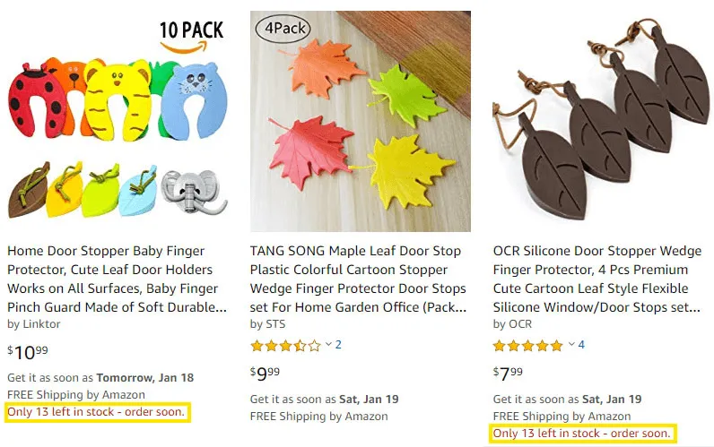
Source: Ryanhogue
However, they do it in a way that doesn’t feel forceful, as well as having intense pressure to purchase something. Maintaining that balance can lead to better conversions and happier customer feedbacks in the long run.
Time to Rethink Your Call to Action Strategy!
Every touchpoint with your audience matters when designing your CTAs. Your CTAs are more than just buttons or phrases—they are opportunities, invitations, and connections. Whether you're offering a solution, an experience, or a promise, your CTA carries the weight of that proposition.
So, it’s important to make sure your CTAs are a blend of clarity, persuasion, and genuine value. The mistakes we have highlighted in the article are not just pitfalls but learning opportunities. By being aware of them, you're already a step ahead.
Each point discussed offers clarity into the dos and don'ts, guiding you toward creating CTAs that resonate, motivate, and convert.
Related blog posts
How to Analyze Your Brand Mention in AI Responses
Being mentioned in AI responses is only the beginning. We give you 6 factors to consider when analyzing your brand mentions and AI visibility.
18 June 2026
Introducing AccuRanker’s Unified Filtering Experience
AccuRanker's unified filtering experience brings the filter bar, dynamic tags, saved segments, and the API into a shared filtering engine.
9 June 2026
Why Your CTR Model Is Betraying You
A static CTR model relies on fixed averages. AccuRanker's dynamic CTR model accounts for 120+ factors to calculate a keyword's expected CTR.
2 June 2026