
Website Architecture: 7 Practical Tips to Improve It

Erik Emanuelli
January 18, 2024
Discover 7 practical tips to enhance your website architecture. Learn how to optimize navigation, improve user experience, and boost SEO performance for better online presence

Website architecture is often one of the most overlooked technical elements.
A well-designed structure can not only improve the overall site performance but also make it easier to maintain and scale in the future.
And, most important, it enhances the user experience.
So, without further ado, let's see how you can improve yours.
What Is Website Architecture?
It refers to the overall structure and organization. It includes everything from a sitemap, navigation menu, URL structure, internal linking, and other technical aspects.
A well-designed website architecture ensures that all elements work together seamlessly to create a user-friendly and efficient browsing experience.
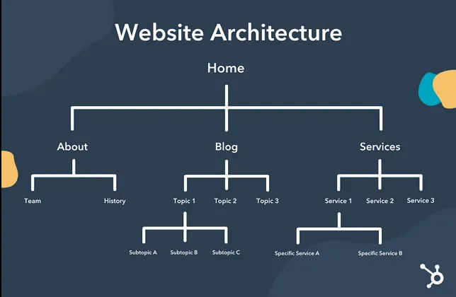
Source: Hubspot
Why Is Website Architecture Important for SEO?
Website architecture plays a crucial role in SEO.
Here are some of the key reasons:
Crawlability: A clear and organized structure makes it easier for search engines to crawl your site and index its pages.
Page Authority: Proper internal linking can help spread authority across different pages on your site, boosting the overall ranking potential.
User Experience: A well-designed architecture ensures that users can navigate your site easily, increasing their time on site and reducing bounce rates.
Mobile Optimization: A good website architecture takes into account mobile responsiveness, which is a crucial factor for SEO in today's mobile-driven world.
Source: Semrush
Examples of Good Website Architecture
Now, to better understand the concepts, let's take a look at some examples of good website architecture.
Apple
Apple's website has a simple and clean design, with easy navigation through clearly labeled categories.
The site also makes great use of internal linking, guiding users smoothly from one page to another.
There are beautiful images and minimal text, making it easy for users to find information without feeling overwhelmed.

Source: Apple
Airbnb
Airbnb's website is another example of effective architecture. Its well-organized menu makes it easy for users to find what they are looking for.
The site has a mobile-friendly design, with fast loading times, making it convenient for users on smartphones or tablets.
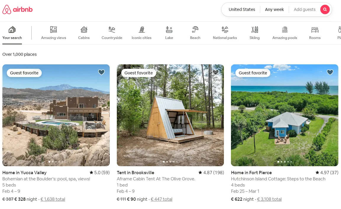
Source: AirBNB
Accuranker
Accuranker's website has a well-structured design, with clear categories and subcategories.
The site also makes use of internal linking to guide users through various features and resources.
It is mobile-responsive, with quick loading times, making it convenient for on-the-go browsing.
How to Improve Your Website Architecture
Now that we have seen some great examples, let's discuss how you can improve your website architecture:
Plan Your Site Structure
Simplify Navigation
Write Clear and Descriptive URLs
Optimize Internal Linking
Consider Mobile Responsiveness
Use Breadcrumbs
Prioritize User Experience
Plan Your Site Structure
The first and most crucial step is to plan your site structure. This includes thinking about a sitemap, defining categories and subcategories, and deciding on the hierarchy of pages.
The top content should be the most important and relevant, making it easy for users to find what they are looking for.
If you sell products or services, you should also consider the buyer's journey and design your structure accordingly.
For example, you can use categories like "Shop" and "Products" to showcase your offerings, with subcategories for different types of products.
Pro tip: look at your competitors' site structure for inspiration, but make sure to create a unique and optimized design. Everything should be aligned to the user's needs and preferences.
Simplify Navigation
Navigation is a crucial element of website architecture. It should be simple, intuitive, and easy to use.
Avoid using too many dropdown menus or unnecessary subcategories. Instead, group similar pages together and add clear labels that are easy to understand.
Also, consider implementing a search bar to make it easier for users to find specific pages.
Now, there are different kinds of navigation menus to choose from:
Horizontal bar
Dropdown menu
Hamburger navigation
Vertical menu
Footer navigation
A horizontal bar is a common navigation style, usually placed at the top of the page. It typically has broad categories with dropdown menus for subcategories.

A hamburger menu is a popular choice for mobile devices, as it takes up less space. While the footer navigation typically contains links to essential pages on your site.
Pro tip: whether you choose, think about your audience. What works best for them? What are they looking for on your site?
For example, if you have a local car dealership, a dropdown menu with different car models may work best. Then, on the car pages, you can have a vertical menu with options for "Specs," "Pricing," and "Reviews." And a button that links to your finance or commercial department, to finalize the deal.
Write Clear and Descriptive URLs
A URL is the address of a web page, and it serves as the identifier for that particular page on your site. In terms of website architecture, it helps search engines find and understand your content.
Here are some tips for writing clear and descriptive URLs:
Use keywords: Include relevant keywords in your URL to help both users and search engines understand the content of the page.
Keep it short: Shorter URLs are easier to read and remember, making them more user-friendly.
Use hyphens: Instead of using spaces or underscores, use hyphens to separate words in your URL. This helps with readability and ensures that search engines can interpret each word correctly.
Match title tags: Your URL should match your title tag to provide consistency and improve user experience.
For example, instead of having a URL like:
you should write something like this:
www.example.com/blog/improve-website-architecture
Pro tip: remove any unnecessary information or numbers from your URLs. This not only simplifies them but also makes them more memorable and shareable.
Optimize Internal Linking
Internal linking helps users navigate through your website, as well as spread the authority of your site across various pages.
Here are some tips for optimizing internal linking:
Use relevant anchor text: Anchor text is the clickable text in a hyperlink. Use descriptive and relevant anchor text to give users an idea of what the linked page is about.
Link from high-authority pages: Linking from high-authority pages can help improve the ranking of other pages on your site.
Avoid linking excessively: Don't overdo it with internal links, as this can confuse users and affect their experience on your site.
Link contextually: Whenever possible, try to link naturally within the content. This not only helps with user experience but also makes the links more relevant and valuable to search engines.
Pro tip: regularly review your internal linking structure and make necessary changes based on analytics data. This can help you identify popular pages that could benefit from more internal links and any broken or irrelevant links that need to be removed.
Consider Mobile Responsiveness
In today's digital age, having a mobile-responsive website is crucial. With the rise in mobile usage, it is essential to optimize your site for smaller screens.
Here are some tips to streamline the process:
Choose a responsive design: A responsive design automatically adjusts the layout of your site based on the device it is being viewed on. This ensures that your site looks good and functions well on any screen size.
Optimize images: Compress images to reduce their file size for faster loading times on mobile devices.
Use readable fonts: Text should be easy to read, even on smaller screens. Avoid using small font sizes or overly decorative fonts.
Simplify navigation: Mobile users tend to have shorter attention spans, so make sure your mobile navigation is simple and easy to use.
Pro tip: test your website using tools like Google's Mobile-Friendly Test to ensure it looks good and functions well on different devices.
Use Breadcrumbs
Breadcrumbs are a design element that shows the visitor's location within your site hierarchy. They are a useful addition to website architecture as they provide context and help users navigate through your site.
For example, in this backtesting software review page by ModestMoney, you can see how breadcrumbs help the users identify, at a glance, where they are and how to easily browse the website content.

So, to help you with site optimization, here are some tips:
Use them consistently: Make sure to use breadcrumbs on every page of your site. This ensures that users can easily backtrack or switch between pages.
Keep them clear and simple: Breadcrumbs should be easy to understand and follow, so avoid using complex terms or jargon.
Make them clickable: Make each breadcrumb element a clickable link, allowing users to jump back to previous pages quickly.
Pro tip: use Schema.org markup for breadcrumbs to help search engines understand the structure of your site better. This can also improve the appearance of your site in search engine results pages.
Prioritize User Experience (UX)
Ultimately, the goal of website architecture is to create a positive user experience. This means designing and developing your site in a way that makes it easy for users to navigate, find what they need, and complete desired actions.
Here are some tips for prioritizing user experience:
Keep things simple: Don't overload your pages with too much information or design elements. Keep things simple and easy to understand.
Ensure fast load times: Users expect websites to load quickly, so optimize your site for speed by compressing images and minifying code.
Make important information easily accessible: Important information (such as contact details or pricing) should be easy to find on your site. Don't make users dig through multiple pages to find what they need.
Include calls to action: Encourage users to take action on your site by including clear and prominent calls to action. This can be anything from "Sign up now" to "Download our free guide."
Pro tip: regularly test your site's user experience through user testing or heat mapping tools. This can help you identify any pain points or areas for improvement.
Conclusion
In summary, optimizing website architecture is essential for creating a user-friendly and search engine-friendly website.
Be sure to follow the tips outlined in this article, such as creating a clear and organized hierarchy, using SEO-friendly URLs and titles, optimizing internal linking, considering mobile responsiveness, using breadcrumbs effectively, and prioritizing user experience.
Related blog posts
Introducing AccuRanker’s Unified Filtering Experience
AccuRanker's unified filtering experience brings the filter bar, dynamic tags, saved segments, and the API into a shared filtering engine.
9 June 2026
Why Your CTR Model Is Betraying You
A static CTR model relies on fixed averages. AccuRanker's dynamic CTR model accounts for 120+ factors to calculate a keyword's expected CTR.
2 June 2026
AccuRanker Launches App in ChatGPT
AccuRanker Search Intelligence is our official app in ChatGPT. It enables you to chat with your AccuRanker or AccuLLM data inside the LLM.
27 May 2026