
The Magic Of Turning Boring Data Into Captivating Content

Robin Talley
October 10, 2023
Learn how to breathe life into dull data with creative storytelling techniques in this article on turning boring data into captivating content.

Whatever industry you’re in, there’s a strong chance that you have quite a stash of data sitting around. And guess what–market and competitor research (and any other data you may have gathered) doesn’t have to be boring and can even add value to your customers. Turning data into captivating content is a great way to make it work twice as hard, giving you more bang for your buck.
To get started, think about why the data you’ve collected could be attractive to your customers, then present it in a way that makes it easily digestible, shareable, and fun. With a bit of know-how and a dash of creativity, your ‘boring data’ can become intrinsically engaging, just like some of the examples below.
Pay attention, and turn your boring data into content you can be proud of.
Turning Data into an Interactive Tool
By thinking about the value the data might have to the general public (Wouldn’t you be interested to know if you could earn more doing the same job elsewhere?), then presenting it as a fun tool that users can engage with, brands have added considerable value.
Interactive Quizzes
Interactive quizzes are powerful for turning dull data into something fun and engaging. They allow users to interact with the data directly, making the experience more personal and memorable. For example, a health website might use a quiz to help users understand their risk factors for certain diseases based on various data points.
Quizzes can also help break down complex data into easier-to-understand pieces. Each question in an examination can represent a different data point, and the answers can help users see how these points relate to their own lives. Moreover, companies use quizzes to collect data from their audience, providing valuable insights into their preferences, behaviors, and knowledge levels.
Interactive Polls
Quizzes, interactive polls are another effective method for transforming data into an engaging tool. Polls simplify data by asking users to choose from pre-defined options. It makes it easy for users to participate, even if they don't understand the presented data.
Polls also give users a voice, making them feel more involved and invested in the content. They can see how their responses compare to those of others, which can lead to further engagement. For example, a news site might use a poll to gauge public opinion on a hot-button issue, presenting the results in real-time.
The main takeaway here is that useful content can boost audience engagement, ensuring they stay on-site longer. Think about your data’s value and present it in an easily digestible way.
Tour Your Users through History
 Source: Postmediasolutions
By comparing brand data with information already in the public domain, they can discover the story behind all those mind-numbing figures. Storytelling is massive news in content marketing—it can humanize a brand, making it seem more relatable and relevant in the real world; it's all fantastic information for the bottom line.
Select Relevant Historical Data
The first step is to identify data that has historical significance for your audience. It could be data related to significant events, trends, or comparisons between different periods. Remember, the key is relevance - the data should be meaningful to your audience.
Set the Historical Context
Present your data within the broader historical context. It helps your users understand the significance of the data and its impact on the course of history. It could involve discussing events leading up to the data point or explaining the historical period in which the data was collected.
Use Storytelling Techniques
Data alone can be hard to engage with, but weaving it into a narrative can bring it to life. Use storytelling techniques to create a compelling narrative around your data. It could involve creating characters, setting scenes, or building suspense.
Visualize Your Data
Visuals are a powerful tool for engagingly presenting data. Use infographics, charts, timelines, or interactive maps to display your data. It can make complex data more accessible and help users visualize historical trends and patterns.
Make Connections to the Present
Help your users understand the relevance of the historical data by linking it to the present. It could involve showing how past trends have shaped current circumstances or how understanding the past can inform decisions today.
Encourage Interaction
Turn your historical data tour into an interactive experience. It could involve quizzes to test your users' knowledge, polls to gather their opinions, or discussion forums for them to share their thoughts.
Takeaway: Think about the narrative behind your data. How can you explain it? Who might be interested in this story? Answer those questions, and you’ve got the beginnings of some brilliant content.
Bring a Little Fun to Your Data and Create a Game
In its raw form, data can be tedious and challenging to process. However, by transforming this data into an interactive game, you can make it engaging, educational, and fun for your audience. Here's how to turn those dull spreadsheets into an exciting game that captivates your users.
Identify the Purpose of the Game
Before creating the game, consider what you want your audience to learn or achieve from it. It could be understanding complex data, learning about trends, or engaging more with your content. Having a clear purpose will guide the design and development of your game.
Choose the Right Type of Game
The type of game you choose should align with your purpose and the nature of your data. Quizzes are great for testing knowledge, puzzles can help users understand complex relationships, and simulations can demonstrate the impact of different variables.
Incorporate Your Data
Now comes the crucial part - incorporating your data into the game. It could involve using data to set challenges, score points, or determine the game's outcome. Ensure the data is presented in a simplified and understandable way without losing its essence.
Make It Interactive
Interactivity is critical to engaging users in your game. It could involve allowing users to manipulate data, make decisions based on data, or compete with others based on their understanding of the data.
Provide Feedback
Feedback helps users understand how well they interact with the data and what they learn from it. It could involve providing scores, leaderboards, or explanations of the correct answers.
Takeaway: Even if you haven’t the budget for this nifty little game, try creating a microsite that allows your audience to compare themselves to your data. A little competition can be healthy in content marketing!
Got Geographical Data? Give an Interactive Map a Try
 Source: MapsofIndia
Have you ever tried figuring out where and when to get away for the weekend without breaking the bank? Entering the same information repeatedly, only to give up and have that nice little pot of money frittered away on clothes, takeaways, and the odd concert ticket?
Takeaway: By determining what customers want from their data, they’ve derived its value and created something genuinely valuable for them. If your content is applicable, it will get shared, driving up your traffic and sales.
Implementing Infographics, Charts, and Diagrams
As such, presenting data in an engaging and easily digestible manner has become increasingly important. Infographics, charts, and diagrams are powerful tools that transform complex data into captivating content. Here's how.
Using Infographics
Infographics are visual representations of information that combine text, images, charts, and graphics. They marry fascinating data and statistics with visually appealing elements, making data more understandable and engaging. Infographics can explain concepts, make a boring topic interesting, or tell a story.
Incorporating Charts
Charts help display quantitative data clearly and concisely. They can present data visually, grabbing viewers' attention and making the data you want to give more aesthetically pleasing. The type of chart you choose (bar, line, pie, etc.) will depend on the nature of your data and what you want to convey.
Utilizing Diagrams
Diagrams, like flowcharts or process diagrams, can help break down complex processes or relationships into simpler, understandable parts. They can be instrumental when explaining a sequence of events or showing a system's structure.
Making it Beautiful
The aesthetics of your infographics, charts, and diagrams matter. A well-designed, beautiful visual not only attracts attention but also increases comprehension. Use colors, fonts, and layouts effectively to enhance clarity and readability.
Avoiding Clutter
While it's essential to provide comprehensive data, keep your visuals manageable. Keep your design clean and clutter-free. If using a background image, ensure it doesn't distract from the data.
Making it Interactive
Interactive visuals can boost engagement further. They allow users to explore data at their own pace and can provide personalized insights.
By incorporating infographics, charts, and diagrams into your content strategy, you can turn boring data into captivating content that resonates with your audience.
The Takeaway
It’s all about value again here, but this time, it’s about making your data more easily accessible. If your site is already data-driven, think about how best to present this data to your audience. Remember, 70% of all our sensory receptors are in our eyes, and we can get a sense of a visual scene in less than one-tenth of a second. Present your data visually to make it easily digestible and shareable.
Hopefully, these five examples have convinced you there’s no such thing as ‘boring data.’ Consider why your data is relevant to your audience, and you can create content as captivating as the brands above. Try it and let us know how it goes in the comments below!
Related blog posts

How to Analyze Your Brand Mention in AI Responses
Being mentioned in AI responses is only the beginning. We give you 6 factors to consider when analyzing your brand mentions and AI visibility.
18 June 2026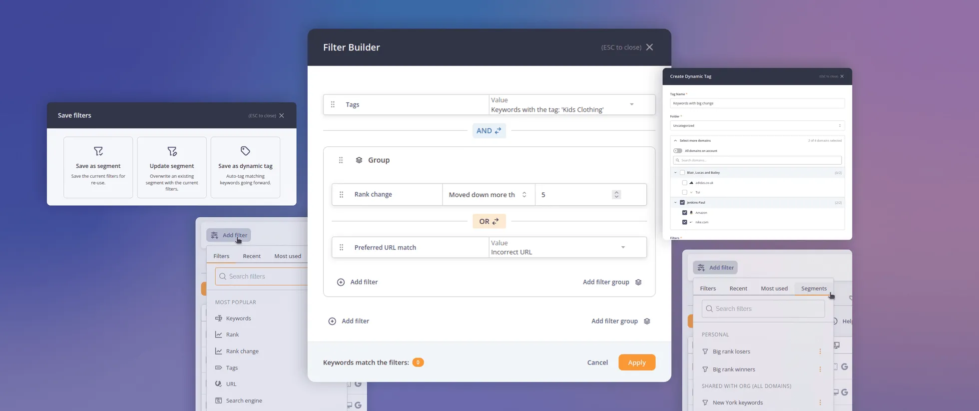
Introducing AccuRanker’s Unified Filtering Experience
AccuRanker's unified filtering experience brings the filter bar, dynamic tags, saved segments, and the API into a shared filtering engine.
9 June 2026
Why Your CTR Model Is Betraying You
A static CTR model relies on fixed averages. AccuRanker's dynamic CTR model accounts for 120+ factors to calculate a keyword's expected CTR.
2 June 2026