Color Psychology: Crafting Brand Messages through Emotional Palette

Andre Oentoro
September 26, 2023
If you understand color psychology, it will help you explore the fundamental theory of colors for brands and marketing, along with the benefits. Check it out!

Can you think of colors associated with certain brands? For example, Hermes’ signature color is orange, while Coca-Cola’s is vibrant red. These colors are present in their logos, typography, and even packaging.
Not only is every color meaningful, but associating colors with your brand also helps it to stand out and be memorable. However, choosing a signature palette can be confusing, especially if you don’t understand the psychology of colors.
No worries! This article will help you explore the fundamental theory of colors for brands and marketing, along with the benefits and palette generator recommendations. So buckle up, and let’s get started!
The Psychology of Colors: Understanding the Meaning
When talking about color psychology, Carl Jung is often associated with this matter. Jung’s innovation involved defining the four temperaments of colors: Cool Blue, Earth Green, Sunshine Yellow, and Fiery Red.
In a nutshell, here’s the meaning associated with each of them: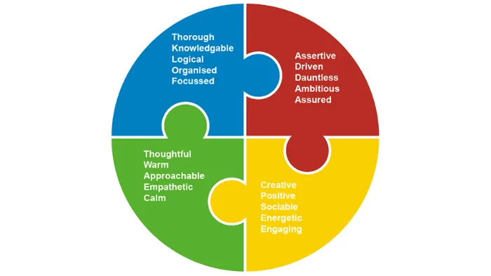 Source: tcwfoundation
This early theory then evolved into more comprehensive explanations of more hues. In business and marketing practices, some common color-meaning associations include:
The psychology of red
Red, one of the most attention-grabbing colors, is often used in marketing, whether in landing pages, newsletters, explainer videos, or other marketing materials. It’s common to spot brands using red for “order now” buttons or packaging to stand out prominently.
The reason is clear: red is one of the most intense hues and can evoke powerful emotions. Moreover, incorporating red can be impactful, especially when reserved for CTA buttons or sale indicators. It ensures the color stands out effectively against the site’s overall design.
Many big brands use red as their logo color, such as Coca-Cola and YouTube. The red in Coca-Cola triggers appetite, while on YouTube, it evokes excitement. While many social platforms use softer colors, YouTube stands out by using one of the most impactful colors.
The Psychology of Blue
Blue in branding can bring a sense of stability, harmony, peace, calmness, and trust. Many brands use blue in their logos and website designs. In websites particularly, blue is believed to engage visitors longer.
Meanwhile, many online businesses incorporate blue for elements like guarantee badges, trust certifications, or icons denoting free shipping. The color emphasizes credibility and trustworthiness.
Moreover, this color is popular among tech and health products or services. We can see that big social media platforms like Facebook, Twitter, and LinkedIn use blue as their logo color.
The Psychology of Green
Green often symbolizes nature, growth, and health. Many also associate the green color with money and generosity. It’s particularly suitable for businesses and brands seeking to emphasize their commitment to sustainability and a wholesome lifestyle.
Health and wellness brands specializing in organic, natural products might opt for a predominantly green color scheme. Meanwhile, a financial business can use green strategically for website buttons indicating secure transactions and investment opportunities.
But bear in mind that green isn’t limited only to these two industries. For example, Starbucks, as a beverage brand, also chose green as the only color in its logo, which symbolizes inviting, relaxing, and reminiscent of a coffee shop’s cozy ambiance.
The Psychology of White
White is often associated with purity, cleanliness, and simplicity. It conveys a sense of freshness and innocence. In some cultures, white also denotes spirituality and new beginnings.
In addition, this color creates a feeling of spaciousness and openness. In website design and branding, white is vital to emphasize clarity and minimalism so brands can communicate messages effectively.
This color is suitable for all industries, from fashion to tech products. Nike, Gucci, and Apple are some global brands that successfully use white as their signature color. These brands focus on conveying simplicity and elegance.
The Psychology of Black
Black is often associated with sophistication, formality, and mystery. I
Culturally, black carries various meanings but mainly symbolizes elegance and refinement. In branding and marketing, black evokes a sense of strength and seriousness, creating a sense of depth and luxury.
For instance, using black for CTA buttons on landing pages can grab attention, give power to the message, and show brand authority. On top of that, black is a solid color that signifies simplicity. However, using black excessively might also feel heavy, so balance is crucial.
The psychology yellow
Brands that want to show a dynamic and youthful image often use yellow in their branding efforts. Yellow also represents positivity, optimism, and energy, which can evoke feelings of happiness, warmth, and friendliness.
Yellow is also an attention grabber. Marketers often use yellow to create a sense of urgency or highlight key information. Therefore, yellow can also be incorporated for a CTA button to capture attention and immediate action.
The psychology of orange
Orange is the result of red and yellow combined. That’s why its trait represents the root colors. It’s related to enthusiasm, energy, and excitement. It also signifies creativity, warmth, and approachability.
In addition, orange invokes a sense of movement and encourages interaction. Marketers often use this color to promote sales and limited-time offers, as it develops a sense of adventure and encourages impulse buying.
The psychology of pink
Pink is a preferred color if a brand’s target customer is female. It sparks femininity and sweetness. Most often, many also connect pink as a symbol of romance, compassion, and playfulness.
When incorporated into marketing, pink brings a calming effect and can evoke feelings of comfort. Moreover, this color is sought-after in the fashion and beauty industry, including products for young female audiences.
The psychology of purple
Purple is famous for representing luxury, creativity, royalty, ambition, and spirituality. Different shades of purple can evoke varying emotions.
Darker shades communicate a sense of power, while lighter shades convey a more whimsical tone. Brands use purple in branding and marketing to exude luxury branding, sophistication, and elegance image.
The psychology of brown
Brown signifies earthiness, comfort, and simplicity. When applied in marketing, brown can establish a down-to-earth and trustworthy image.
Even though this color may not be as popular as the previous options, various shades of brown are suitable for brands aiming for a rustic or vintage aesthetic.
Where Should You Implement Signature Colors?
Your signature color should be present in many aspects, including your website, social media, physical product, and packaging. Here are some elements to infuse your brand color.
#1. Logo
A logo is the most prominent visual representation of a brand. Choosing colors for your logo should be done carefully, as it will create a long-term impression on customers.
The logo color must also align with the brand’s identity and values. Some brands use one solid color for their logo, but others also use multiple colors to convey different meanings.
#2. Signature
The use of signature colors extends beyond the logo. They can be integrated into all branding materials, from business cards and letterheads to promotional materials and advertisements.
A colored brand signature can also benefit your email marketingstrategy. Adding a colored signature to your brand can boost credibility and build a professional image.
#3. Websites
Your website is a powerful platform for showcasing your brand’s personality and values. Integrating signature colors into your website’s design is essential for every brand.
Incorporating colors appropriately creates a cohesive and immersive experience for visitors. For example, color implementations in backgrounds, headers, buttons, and text help reinforce brand recall and aid in navigation.
#4. Social Media
Visual content is the lifeblood of social media. Consider incorporating a consistent color scheme into your images and video content to build a distinct brand identity and stand out.
You can infuse your brand signature color into illustrations, graphics, typography, and video effects. Also, show your brand color on your photo profile for instant recognition.
#5. Packaging
For products, packaging is the first physical interaction consumers have with your brand. Signature colors on packaging create an immediate connection between the product and the brand.
They help products stand out on shelves and reinforce the brand’s identity. Carefully designing your product packaging can impress customers, resulting in a professional brand image.
You can also incorporate your selected color scheme into your email newsletters and landing pages.
How to Choose and Include Signature Colors?
If you’re unsure where to begin, we’ve listed the steps to decide your signature colors. As an initial step, try answering the question below:
#1. What Values Does Your Brand Carry?
First and foremost, answer this question: “What values does your brand carry?” “What products do you offer customers?” and “What image do you want to build around your brand or campaign?”
Narrowing your brand image, values, and marketing messages helps you select meaningful colors. For instance, earthy and green colors might fit if your brand values sustainability and nature.
In another case, bold and vibrant colors could be more appropriate if your brand focuses on creativity and innovation. Moreover, it’s important to note that your color selections may also vary when running different marketing campaigns.
It’s important to be flexible yet mindful when choosing a color palette. Ensure the selected colors can communicate the brand image and campaign messages effectively.
#2. Who is Your Target Audience?
The second question is: Who are your target customers? Understanding and identifying your target customers is crucial for effective branding. Studies indicate employing color can lead to an 80% surge in brand recognition.
Furthermore, different demographics have varying preferences and emotional responses to colors. So, you should consider factors like age, gender, culture, and interests of your target audience.
For example, if your target audience is young and energetic, you might lean towards brighter, more dynamic colors. You might opt for elegant and subdued tones if your audience is more mature and sophisticated.
Combining two or more colors is also possible. However, ensure they blend harmoniously and create an excellent contrast to capture the audience’s attention.
#3. Match Brand Values with Color Psychology
Have you identified your brand values? It’s time to align the values surrounding your brand with the color psychology. As we understand that every color signifies different meanings and emotions, you must proceed with this stage carefully.
An important tip is to study your competitors. Look for brands that offer similar products and carry similar messages as you. Study their color scheme and whether or not it’s appropriately implemented. You can choose different colors to distinguish your brand from others.
#4. Let’s Limit Your Palette
When we talk about “limiting your palette,” we’re referring to choosing a specific set of colors to represent your brand consistently across all materials and platforms. Rather than using various colors and shades, focusing on a select few creates a cohesive and recognizable visual identity.
This limited palette becomes your brand’s or campaign’s signature colors. If you struggle to choose well-contrasting colors, try finding inspiration from visual platforms like Pinterest. There are also platforms designed to find color signatures, which we’ll discuss later in this article.
Limiting your palette ensures that your brand’s communication remains clear and uncluttered. This doesn’t mean you can’t use other colors occasionally, but your signature colors should always take precedence.
#5. Testing and Refining Your Colors
After selecting your signature colors, testing them across various contexts is important to ensure they work well together and evoke the desired emotions. You may ask, “Why is this stage crucial?” Different screens, materials, and lighting conditions can affect how colors appear.
Testing helps you identify any potential issues and make adjustments as needed. In addition, continually monitoring how your chosen colors resonate with your audience is necessary by observing how people react to your branding and collecting feedback.
Meanwhile, refining your colors might involve fine-tuning shades or adjusting their prominence based on how they’re received. Remember that branding isn’t static; it’s an evolving process that should respond to your audience’s preferences and changing trends.
You can analyze engagement rates and conversions to test and refine your color scheme. You can also seek insights and opinions via interactive posts like polls. These strategies help you gain insights into the effectiveness of your color choices.
#6. Think About Longevity and Consistency
Considering longevity and consistency in color choices is vital for building a solid and enduring brand identity. Longevity refers to the enduring relevance of your chosen colors over time. While trends come and go, your signature colors should remain relevant and resonant with your target audience for years.
Meanwhile, consistency involves using your chosen colors uniformly across all brand touchpoints. It could be your logo, website, marketing materials, social media like Instagram feeds, and physical products. Consistency reinforces brand recognition and helps establish a strong visual association between your brand and its colors.
When customers consistently encounter the same colors in connection with your brand, they associate those colors with your products, services, and values. It’s also a way to distinguish your brand and products from competitors.
#7. Adjust Colors with Your Campaigns Accordingly
While maintaining a consistent color palette is crucial, there may be times when you need to adjust your colors to suit specific campaigns or initiatives. Different campaigns might target different segments of your audience or focus on distinct messages.
When adjusting colors for campaigns, it’s crucial to ensure that they align with your brand’s identity and values. Consider using complementary colors or variations of your signature colors to create a cohesive visual experience while catering to the campaign’s unique goals.
These adjustments should be temporary and purpose-driven while maintaining a strong connection to your brand identity. This way, you can leverage the power of your established brand colors while tailoring your approach to specific marketing efforts.
Platforms to Help You Choose Colors
To help you generate color palettes, we’ve curated top-rated color palette generator platforms you can try. The following options have generated many positive reviews from digital artists, designers, and marketers alike.
#1. Khroma
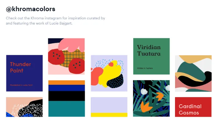 Source: Khroma
Khroma leverages the power of the Google Trends API to empower individuals to discover and perfect their preferred color palettes. It provides an intuitive interface for users to explore and create diverse color combinations that align with their personal preferences and aesthetic sensibilities.
The platform will prompt you to select your favorite colors from a comprehensive selection. The platform has an advanced algorithm to analyze these color preferences. Based on this data, Khroma generates an extensive assortment of color combinations in various formats.
#2. Color Hunt
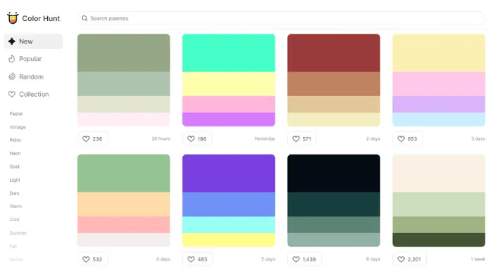 Source: Colorhunt
Color Hunt is a free color palette generator that offers thousands of color options of various shades. Despite offering a costless service, it provides comprehensive features that allow you to do many things on the platform.
For instance, Color Hunt lets you select and store your favorite color palettes, manage personal choices, create collections, and copy color codes. Better still, this platform also provides a Chrome extension for easier access.
#3. Color Space
 Source: Mycolor
Color Space is suitable if you already think of a base color yet are unsure how to create a color palette due to various shades. It offers instant solutions by entering your preferred colors’ RGB values or hex codes.
After inputting your chosen colors, select “generate” to produce various color combination options. That’s it! This platform is perfect if you seek an easy and quick color palette generator.
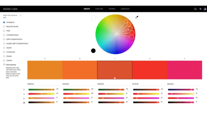
#4. Adobe Color CC
 Source: Adobe Color
If you have an excellent grip on software, Adobe Color is a comprehensive tool for seasoned digital creatives. In a nutshell, it has anything you need to develop an appealing palette from various base colors.
Adobe Color is labeled as a top-tier tool among digital artists. Leverage the ‘explore’ feature to explore limitless color palettes. However, you must create an account and log in to the software to enjoy its features and share your palettes with other users.
#5. Coolers
 Source: Coolors
If you want to generate stunning color palettes within a click away, look no further than Coolors. It’s available for iOS and Android, allowing you to choose signature colors from the comfort of your hand.
Coolors has an easy drag-and-drop interface with a vast color library. It lets you edit palettes and find color alternatives instantly. If you’ve found your desired palette, you only need to copy the hex codes or download the palette.
Takeaway
Finding your color signature for specific purposes can be challenging as you must tailor colors to your brand values and marketing messages. Therefore, learning color psychology is essential to create a stunning color palette.
However, the digital advancement has allowed us to develop color palettes quickly. The above platform recommendations can be your solutions to work more efficiently. Moreover, you can try their free version to save your budget!
Related blog posts
How to Analyze Your Brand Mention in AI Responses
Being mentioned in AI responses is only the beginning. We give you 6 factors to consider when analyzing your brand mentions and AI visibility.
18 June 2026
Introducing AccuRanker’s Unified Filtering Experience
AccuRanker's unified filtering experience brings the filter bar, dynamic tags, saved segments, and the API into a shared filtering engine.
9 June 2026
Why Your CTR Model Is Betraying You
A static CTR model relies on fixed averages. AccuRanker's dynamic CTR model accounts for 120+ factors to calculate a keyword's expected CTR.
2 June 2026