
10 practical design tips to increase newsletter engagement

Catalina Grigoriev
February 21, 2024
Access AccuRanker’s insights on how you can use design elements to increase newsletter engagement [Top 10 practical tips with examples mentioned]
Let’s be real: A good newsletter is just as much about design as it is about content. After all, if content allows you to sell an idea, design elements allow you to set a theme.
Having said that, we know that budgets are tight for most companies when it comes to email newsletters. That’s why getting the input of a UI/UX or design expert might seem like an out-of-reach expense, even if newsletter design is a priority.
Don’t worry. While we may not be designers or UI/UX experts, we’ve gathered some practical design tips from experts that can help you get started and improve your newsletter engagement rates.
On that note, let’s dive in.
#1. Let’s get the basics right
Before getting too deep into our favorite design tips, let’s first discuss the basics.
Try to keep a good balance between content and white space (i.e., you don’t want to overwhelm the reader by writing in long, never-ending paragraphs or cluttering your layout).
Keep your subject lines and content of optimal character length. Experts suggest keeping sentences between 45–75 characters and subject lines under 45 characters for comfortable reading.
Use a responsive design with high-quality images. Or, at the very least, prioritize mobile-friendly email designs so there’s no blip in user experience.
Put accessibility at the forefront when creating newsletter design. For example, you can add tags to images and opt for color, font, and contrast choices that comply with web accessibility standards.
Add an unsubscribe button for those recipients who prefer to opt out of your email list. These small details boost trust in your brand.
Now, for the golden rule. Always keep a clean design that allows the reader to focus on the actual content.
For example, Clean Origins’ New Year’s newsletter highlighted its core product of engagement rings by keeping a simplistic and clean design. It’s the perfect match for such a luxurious product.
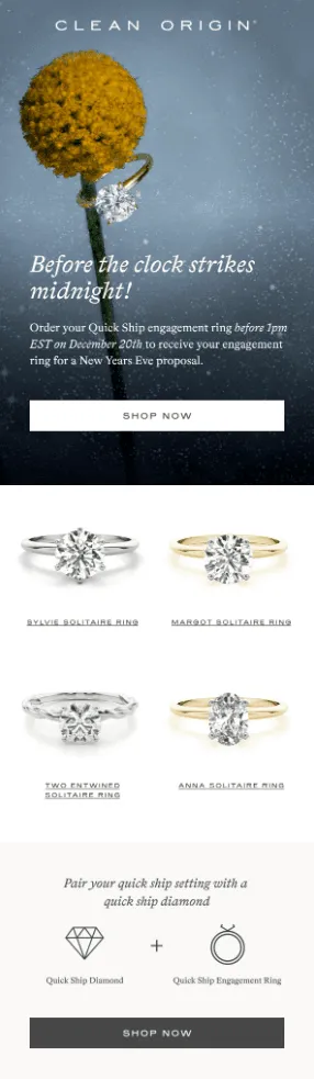 Source: Milled
Remember, sometimes less is more. Keep it true to your core offering, and you can’t go wrong.
#2. Use eye gazes strategically
If you’re using human faces in your newsletters, facial expressions can convey a lot of information.
According to Katelyn Bourgain, founder of the “Why We Buy” newsletter and an expert in buying psychology, “The human mind loves visual cues. We naturally look for faces — and even instinctively create them out of inanimate objects. This is the same part of your brain that activates when it sees a face and also lights up when you see emojis.”
But if you dive into human faces and features one step further, Katelyn also recommends using eye gazes strategically and keeping eye gazes near your value proposition or CTA (call to action).
In her own words, “People will naturally follow the eye gaze and are more likely to read the copy or notice the product.”
#3. Opt for an inclusive approach
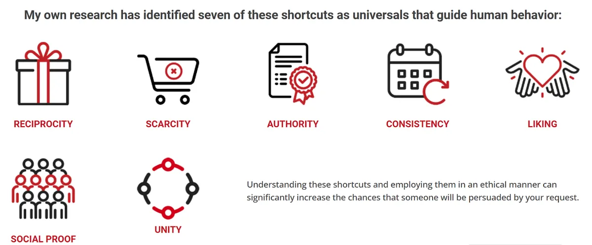
One of Dr. Robert Cialdini’s seven persuasion principles is unity, which states that if people feel more included, they’re far more likely to participate in an activity.
Regarding newsletter design, this means using inclusive elements in your designs (e.g., visuals of people of different ethnicities or with diverse facial features).
You can also use Dr. Robert Cialdini’s principle for producing inclusive content (and not just design and visuals). Some of the recommendations he provides are:
Showing how you’re different from the crowd
Focusing on relatable pain points
Invoking location and familial ties
Using local languages
Adding unique jargon
Sharing experiences
 Source: Influenceatwork
#4. Keep a brand bible on hand
Another tip on the list is to keep a brand bible on hand, which allows you to navigate:
Color palette (for design elements, layout, and content)
Brand colors (and contexts to use them in)
Design layouts for multiple channels
Tones for different social platforms
Formatting requirements
Image sizes and types
Fonts and typography
Logo specifications
Brand personalities
This brand bible will allow you to always maintain consistency with your branding and hence make your readers familiar with your brand, regardless of whichever channel they interact with you on.
Ultimately, in the long run, this familiarity and trust will cause an increase in your engagement rates. In fact, there are many studies that prove brand trust leads to repeat purchases.
Side Note: Although this doesn’t directly come under the brand bible, experts also recommend using optimal grids when creating newsletter designs.
#5. Highlight your CTA (try to make it value-driven, too)
If you wish to increase your call-to-action’s engagement and click rates, here’s a design tip you can implement: make your CTA button a contrasting color from the rest of your text.
For example, here’s what your CTA can look like: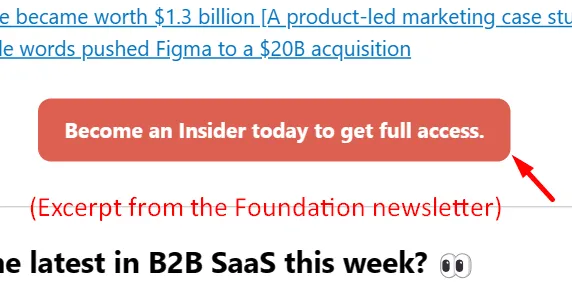
Experts suggest only focusing on one clear CTA instead of multiple CTAs throughout your newsletter copy and using action words and verbs. For example, some of your CTAs can be “Start Now” or “Purchase Today!”
Other recommendations are to:
Repeat CTAs at the end of the copy (so as to not make the reader scan the newsletter again).
Use buttons and graphics instead of text links as CTAs (this will allow you to convert readers faster).
Keep some white space around the CTA to make it stand out.
And since we’re talking about CTAs, one last tip would be to focus on the benefit of completing the task. For example, CTAs like “Sign up for free to access XYZ” will show the value you could get from completing a task as opposed to using a generic CTA like “Sign up!”
#6. Choose a font that goes with your product(s)
Another tip is to choose a font that goes well with your brand personality and the look and feel of your products.
Nick Kolendar, an expert in the field of customer psychology and marketing principles, says your brain will activate visual cues when looking at fonts. Here’s a great example:
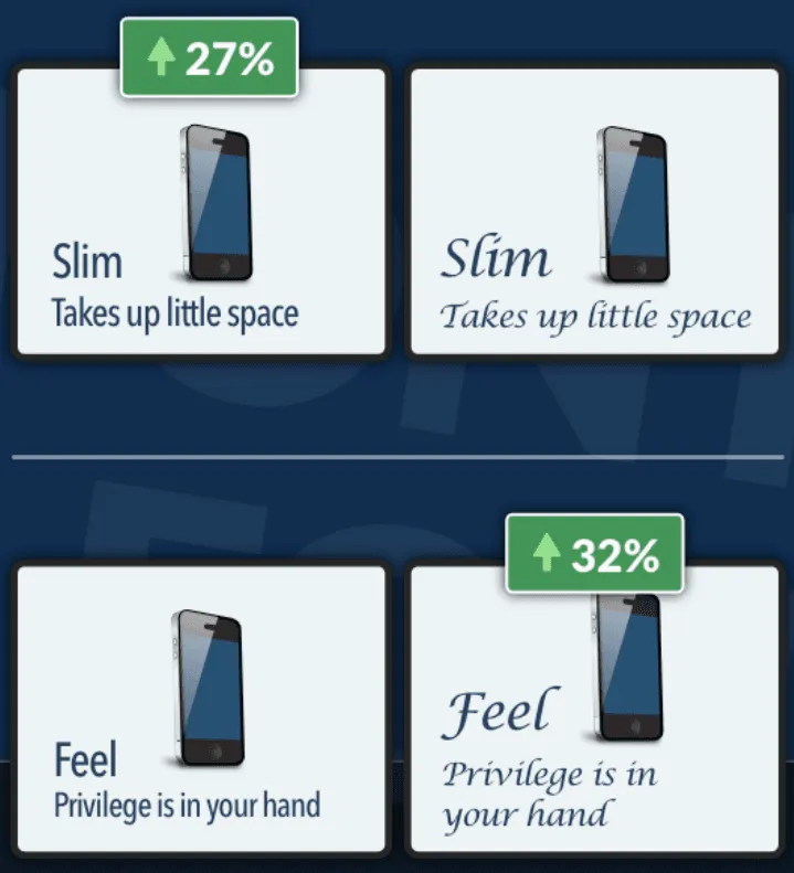
Source: LinkedIn
The example above proves that an ad with a slim font performs better if you are selling a slim phone. Similarly, if you were to sell an elegant phone, fonts that feel elegant will drive more conversions.
Other experts also suggest considering readability and web-safe fonts when finalizing font choices. For example, Arial, Times New Roman, Veranda, Georgia, etc., are all categorized as web-proof fonts because they spell out words clearly and don’t merge into each other.
#7. Use negative space wisely
Design experts also suggest using negative spaces wisely to improve the visibility of important elements like CTAs.
For context, here’s what negative space can look like (notice how it directly pulls your attention to the text highlighted in yellow).
Source: Tubikstudio
According to the pros, you’re supposed to use this negative space to:
Add contrast between it and other background elements (or use it to help the reader navigate the text better).
Highlight your selling points (these could be your CTAs, value proposition, USP, social proof, or anything else).
Maintain a balance between your content and design choices, and format your newsletter accordingly.
Elevate or enhance all elements to make them look more visually appealing.
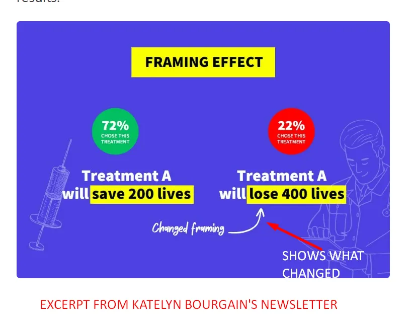
#8. Spell out the details for your readers
Another simple tip on the list, especially if you’re using visuals, is to spell out the details for the reader. This effort will help the reader connect the dots how you want them to, improving the performance of your promotional email.
For example, imagine you run a travel agency and want to send out a graphic with a New Year’s discount offer in your newsletter. Instead of just highlighting your offer in your visuals, consider highlighting what makes the offer special (a.k.a. spell out the details for your reader).
Some of the details you could spell out are:
What kind of accommodation are you going to be staying in (e.g., is it a luxury 5-star hotel?)
Why you’re going around this time of the year (e.g., seasonal highlights could be snow or upcoming events)
Who would this offer be best suited for — family, couples, or someone who’s into adventure?
For example, consider how Katelyn spells out the details in her visuals with the help of arrows, color changes, and highlighted text.
#9. Use color psychology to your advantage
Did you know that color can play a psychological role in your email marketing campaigns?
When it comes to design choices, it’s important to actively see how font and design colors (read: color schemes) can affect the mood of your target audience and/or motivate them to do certain tasks.
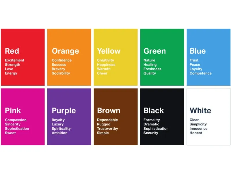
Source: Londonimageinstitute
Side Note: It also benefits to be contextual with your color scheme. For example, the association of colors can be different for email recipients depending on where they live and their education and upbringing.
#10. A/B test elements to see what works and what doesn’t
Last but not least, our recommendation would always be to A/B test different design elements and features to see what works and what doesn’t.
And while you’re at it, consider using heatmaps to see how email clients interact with your content. Not sure where to start? Try out different email newsletter templates and see which ones perform best.
If you notice stock images aren’t resonating, well, try out your favorite design tool and create custom graphics for your next email marketing campaign.
Pro tip: Check out email newsletter examples from your top competitors to see what email templates and the other types of emails they use to score major email clients. It never hurts to take a peek at the competition to inspire upgrades to your email marketing strategy.
Get more design tips from AccuRanker to increase engagement
And that wraps up our blog on newsletter design tips to increase engagement rates.
If you liked it and wish to get more tips on improving your newsletter design (as well as the design, structure, and content of other marketing channels), all you need to do is keep up with the AccuRanker blog!
We post tips, tricks, insider insights, strategies, relevant examples you can copy, and another bunch of cool content regularly! Check out the topics we cover on our blog.
That’s it for today. Best of luck with your next email marketing campaign.
Related blog posts
How to Analyze Your Brand Mention in AI Responses
Being mentioned in AI responses is only the beginning. We give you 6 factors to consider when analyzing your brand mentions and AI visibility.
18 June 2026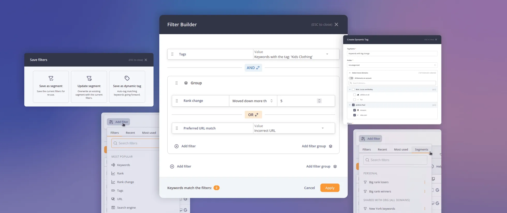
Introducing AccuRanker’s Unified Filtering Experience
AccuRanker's unified filtering experience brings the filter bar, dynamic tags, saved segments, and the API into a shared filtering engine.
9 June 2026
Why Your CTR Model Is Betraying You
A static CTR model relies on fixed averages. AccuRanker's dynamic CTR model accounts for 120+ factors to calculate a keyword's expected CTR.
2 June 2026