
6 SaaS CTA examples to drive conversion

Kinga Edwards
December 24, 2023
Explore 6 compelling SaaS Call-to-Action (CTA) examples designed to boost conversion rates. Elevate your SaaS marketing game with these actionable insights.

Let’s cut to the chase.
A well-crafted CTA can make or break your conversion rates. It's the natural connector that transitions a prospect's interest into a decisive action.
They see, they click, they do.
A compelling CTA can simply turn browsers into buyers. Provided you’ve tackled it the right way.
Today, we won’t just talk about CTAs. We’ll do way more – we’ll show you the examples of not-that-obvious CTAs that can make quite a difference in your strategy.
But, speaking of differences… let’s start with another one.
What is the difference between BOFU CTA, MOFU CTA, and TOFU CTA?
If you were to give a CTA (Call to Action) a role in a theatrical play, the BOFU (Bottom of the Funnel) CTA would undoubtedly be the star, delivering the final, persuasive dialogue that clinches the deal.
It's the decisive moment where the audience (your potential customers) are compelled to take action, having been guided through the narrative of your product or service. This CTA is direct, specific, and tailored to trigger a conversion, often by offering a free trial, a demo, or a compelling discount.
In contrast, MOFU (Middle of the Funnel) and TOFU (Top of the Funnel) CTAs play supporting roles, each crucial in their own right:
The TOFU CTA is the icebreaker, as it initiates the first interaction with potential leads. It's informative and inviting, often offering educational content like ebooks or webinars to pique interest.
The MOFU CTA, on the other hand, is the bridge between initial curiosity and final decision-making. It nurtures the lead, often through case studies or free samples, subtly steering them towards the BOFU.
Each CTA has its unique charm and purpose, all towards a seamless journey from awareness to conversion.
Examples of SaaS CTAs that move the needle
Below, you’ll find a few examples of CTAs that recently caught our attention.
#1 Luzmo – demonstrate the time savings

In the case of Luzmo, their BOFU CTA stands out by its strategic placement and dual approach in this article about embedded analytics. Unlike the rest of the article, where CTAs are notably absent, this one is positioned underneath and can serve as a direct gateway to the trial.
What makes it particularly effective is its twofold nature. It offers two distinct paths: 'Try for Free' and 'Book a Demo'. This approach appeals to various types of users – those who prefer a hands-on experience with the product immediately and those who seek a more guided exploration through a demo.
Moreover, the CTA is universal in its appeal.
It doesn’t narrow down to a specific segment of users but rather opens the door for a wide range of potential customers. This universality ensures that it doesn’t alienate any part of the audience. Offering a quick start ("in less than 15 min") also taps into the user's desire for immediate gratification and efficiency, which is a powerful motivator in the decision-making process.
This CTA effectively captures the essence of Luzmo’s offering – and encourages immediate action.
#2 Capsule – no need to be obvious

Capsule's BOFU CTA from this Quickbooks CRM integration page exemplifies a nuanced understanding of conversion pathways.
It highlights that not all CTAs must lead directly to a sign-up, registration, or immediate conversion. By inviting users to start a free trial through the Quickbooks Marketplace, Capsule aligns its offering with an established platform.
This approach subtly redefines what conversion means.
For Capsule, in this case, the primary goal is NOT just to secure a direct sign-up – it's to integrate their CRM solution into the user's existing workflow with Quickbooks. This strategy acknowledges that conversion is a subjective term and varies from business to business.
And here, Capsule's CTA addresses a specific pain point for its target audience, so that the proposition is automatically more appealing. It's a reminder that conversions are also about creating value and relevance for the user, which in turn drives the desired action.
#3 Instantly – make the images clickable
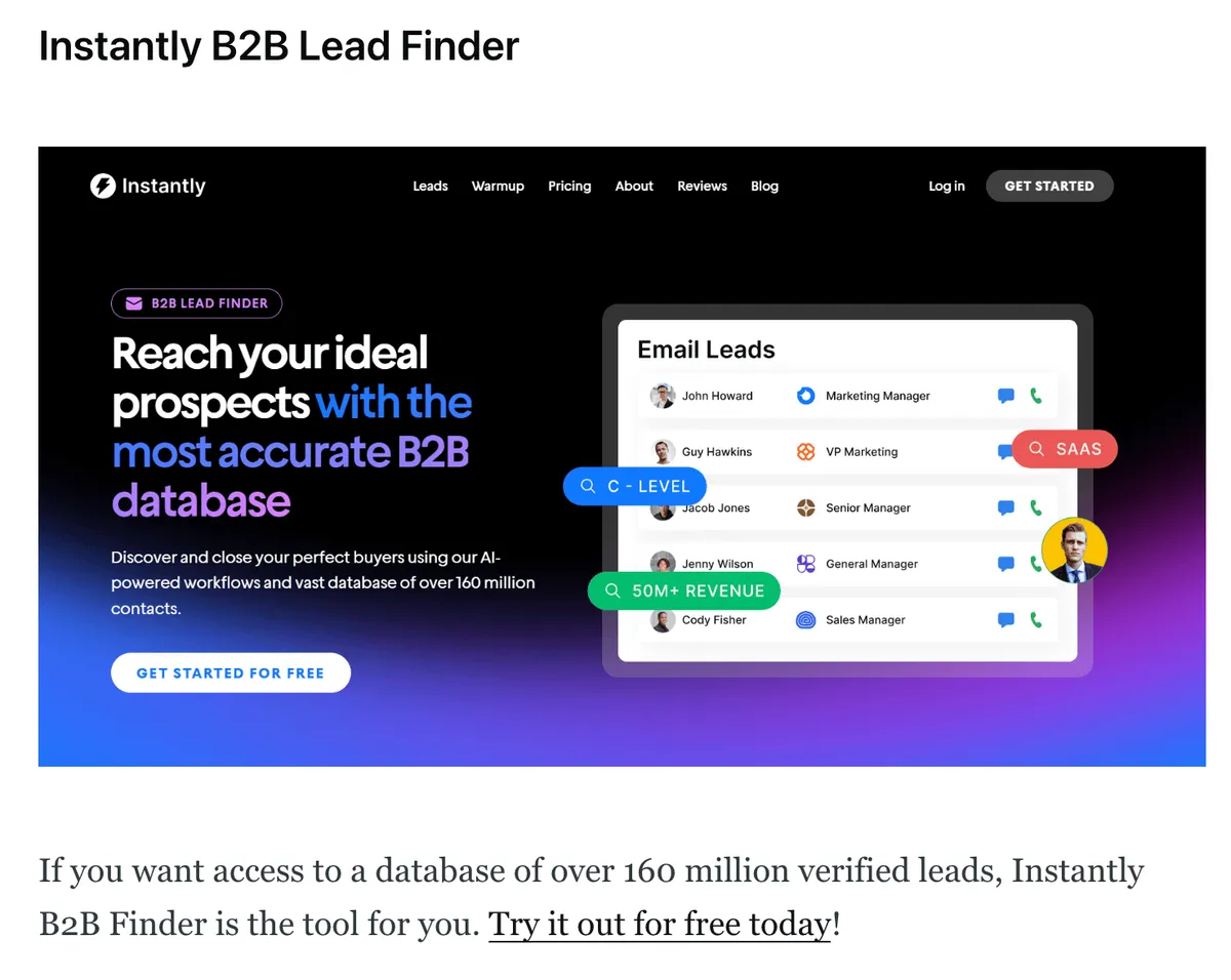
Instantly's approach to its BOFU CTA is both innovative and user-friendly.
In their post on best lead finders, they have implemented a CTA not only in a written format but also as a clickable element under an image. This dual method caters to different user preferences and increases the likelihood of engagement. When users click on the picture, they are seamlessly redirected, enhancing the user experience. No hassle here.
This CTA's placement within the article is natural and unobtrusive, blending well with other content and alternatives presented. It doesn't disrupt the reader's flow but rather complements the information being conveyed. This subtlety in placement ensures that the CTA is not perceived as overly aggressive or out of context, which can be a turn-off for potential leads.
The effectiveness of Instantly's CTA lies in its ability to engage users through multiple formats and its strategic positioning within the content.
#4 Vuestorefront – give some choice
Vue Storefront's approach to BOFU CTAs in their article about SAP Spartacus is a masterclass in contextual and visually engaging design. They employ a double CTA strategy, with one of the CTAs being a floating element.

The CTAs are highly contextual, promoting SAP store-related ebooks within an article focused on SAP Spartacus. As a result, the CTAs resonate with the readers who are already interested in the subject matter.
And since the CTA aligns with the content of the article, Vue Storefront increases the chances of conversion – as the readers are likely to be in the decision-making phase of their buyer's journey.
Moreover, the CTAs stand out visually with distinct colors (green on white background) drawing the reader's attention effectively. This visual distinction is necessary in a content-rich environment, as it helps the CTAs to break through the clutter and grab the reader's attention. The use of color serves a functional purpose by making the CTAs more noticeable and inviting.
#5 Findymail – play with colors
Findymail, similarly to Vue Storefront, uses two types of CTAs in their blog about writing meeting request emails.
One CTA floats on the page, so it's always easy to see,
and the other is written into the article.
No matter where the reader is on the page, the CTA is always visible.
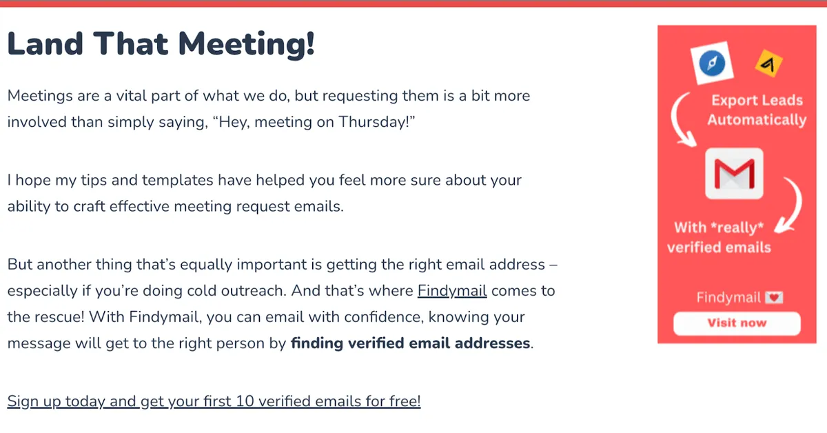
The CTAs actually fit really well with the topic of the article. They don't feel out of place and match what the reader is learning about. This makes the CTAs feel more natural and not like they're just added in as an afterthought.
The CTAs are also colorful, which makes them stand out from the rest of the text. This is important because it grabs the reader's attention and makes them more likely to click on the CTA.
#6 Usebouncer – customize CTAs
Customizing CTAs to specific context/article is time-consuming, troublesome, and – let’s face it – sometimes not even worth it. But Bouncer does a great job with that here.
Their CTAs are really specific to the content in each part of the article. This means that the CTAs fit perfectly with what the reader is learning about at that moment.

For example, in this article about best email verification tools, the CTAs are designed to get the reader interested in trying those tools. This is smart because the CTAs connect directly to what the reader is focused on.
Matching the CTAs with the article's content, Bouncer makes it more likely that readers will follow through on these actions, like checking out a tool or signing up for a service. This approach shows they really understand how to engage their readers and guide them towards useful actions related to their products or services.
Key takeaways
CTAs placed strategically, like at the end of relevant content, significantly increase engagement and effectiveness.
Offering both immediate and guided experiences in a CTA appeals to a broader range of user preferences.
CTAs that align with the content or user's journey stage are more effective in driving conversions.
Distinctive colors and designs make CTAs more noticeable and engaging on a page.
A CTA that explicitly lists benefits encourages action by clearly communicating the value to the user.
Over to you
And you?
How about your CTAs?
Are they strategically placed to catch your audience's attention at the right moment?
Do they offer options that cater to different user preferences?
The relevance of your CTA to your content and the user's journey is necessary for driving conversions. Consider the visual impact of your CTAs – are they designed to stand out and draw the eye? Most importantly, does your CTA clearly communicate the value proposition, making it irresistible for users to take the next step?
Reflecting on these aspects can transform your CTAs from mere buttons to powerful conversion tools.
Related blog posts
Share of Voice Update
We are changing how our Share of Voice metrics work. Read more about what we are changing and what you have to do.
2 July 2026Why You Need Pixel Tracking to Determine Your Visibility
The SERP decides who gets seen, not your ranking alone. Pixel tracking is what you need to know whether users are likely to see your result.
2 July 2026
How to Analyze Your Brand Mention in AI Responses
Being mentioned in AI responses is only the beginning. We give you 6 factors to consider when analyzing your brand mentions and AI visibility.
18 June 2026