
AccuRanker introduces a new Overview page

Peter Emil Tybirk
November 21, 2022
A major update to the domain and group overview.
A long time in the making behind the scenes, AccuRanker has just launched a brand new overview packed with the functionality you will feel like you’ve always missed!
Highlights
The first section of this article gives a short introduction to the highlights of the release. In the next section, we make a deeper dive.
Sparkling new charts
We introduce **eight **new charts and a major overhaul of nine existing charts with improved layout and functionality.
The new charts are
- Average CTR
- Traffic Value
- Estimated Visits
- Search Trend
- Winners and Losers
- Google Analytics and Google Search Console Traffic
- Dynamic Competitor Score Over Time
- Competitors
The updated charts are
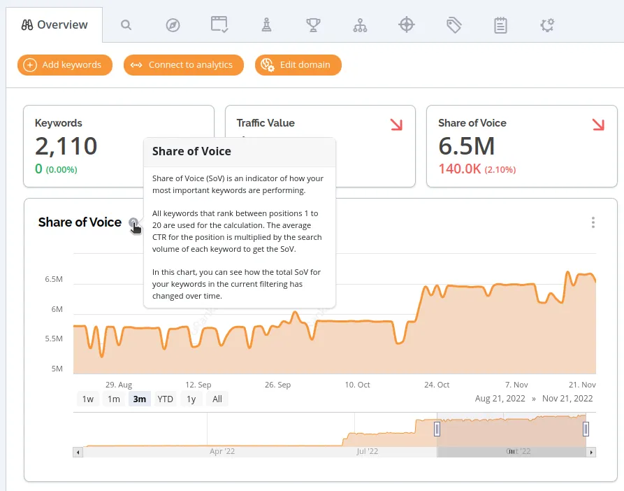
- Share of Voice
- Average Rank
- Ranking Distribution
- Share of Voice by Tags
- Share of Voice by Competitors
- Share of Voice by Landing Pages
- Search Intent
- Dynamic Competitor Score
- Dynamic Competitor Ranks
All charts are available on the new overview page. We will take a deeper look at each of the new charts below. Note, that you can read a succinct description of each chart by clicking on the small question mark next to the chart title.
Customize your overview
We introduce the ability to pick and choose which charts you want to see in the overview! Each user can choose their favorite layout and include the charts they deem relevant. By default, we include
- Share of Voice
- Average Rank
- Competitors
- Ranking Distribution
- Winners and Losers
- Share of Voice by Tags
- Share of Voice by Competitors
- Share of Voice by Landing Pages
- Search Trend
- Google Analytics and Google Search Console Traffic
- Search Intent
- Dynamic Competitor Score
- Dynamic Competitor Score Over Time
- Dynamic Competitor Ranks
Download your data
For all charts, it's possible to download the charts as an image, and for several charts, it's also possible to download the underlying data as a CSV-file! Try clicking on the three small dots in the top right corner for each chart.
Cool colors
The color palette for our charts has been updated. In addition, your own domain will always be orange on all charts with multiple domains, and your competitors will have consistent colors and display names for all charts where they appear.
Notes, notes, notes!
Notes have been added to all relevant charts, also outside the overview. In addition, the interaction with notes is now much smoother, especially when you have many notes, as the new overview automatically groups notes in the UI.
Speed!
The new overview loads in less than a second, even for domains with years of historical data!

Deep dive
Now, let's look a bit closer at the new charts introduced in the overview.
Average CTR
The average click-through rate (CTR) is the average CTR for your keywords weighted by their search volume.
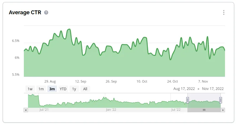
The CTR for the individual keywords is estimated based on a machine learning model. Learn more here. Note that CTR data is not available before June 2021.
Traffic Value
This chart shows the total traffic value for the keywords in the current filtering.
The traffic value for individual keywords is estimated as the average CPC (from Google Ads) multiplied by the Share of Voice for the keyword.
Estimated Visits
This chart shows the estimated visits which is the sum of the CTR times the search volume for all your keywords in the current filtering.
The CTR for the individual keywords is estimated based on a machine learning model. Learn more here. Note that estimated visits data is not available before June 2021.
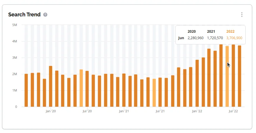
Search Trend
See the combined monthly search volume of all your keywords in the current filtering from three years back to the most recent data. With this data, you will be able to see for instance increase in search volume over time, seasonality of search volume, and peak periods of interest, which combined with Tags, Segments, or Dynamic Tags can provide great insights. Hover over a bar on the chart to see data from a specific month, and note that the same month in other years is automatically highlighted!
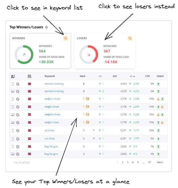
Winners and Losers
Winners are keywords with an increase in rank since the compare date. Losers are keywords with a decrease in rank since the compare date. The compare date is the date selected in the date picker at the top right of the page. You can click the Winners/Losers cards to see the corresponding keywords in the table below or click the icon in the top right corner of the card to see the keywords in the keyword list.
Google Analytics and Google Search Console Traffic
This chart shows the historical evolution of traffic from search engines registered by Google Analytics (GA) and Google Search Console (GSC).
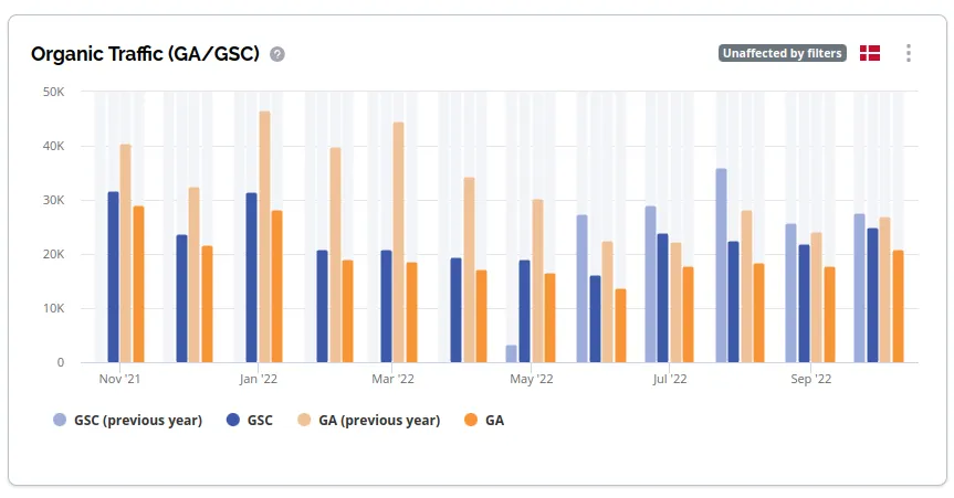
The data we fetch from GA/GSC is filtered to include only traffic from the primary country associated with the domain.
The GA traffic displayed is the number of users visiting from a search engine, while the GSC traffic is the number of clicks registered through GSC. We pull this data directly from the GA/GSC APIs when you connect your account(s).
The data is for ALL your users/keywords in GA/GSC, not just the ones you track. This also means the chart is unaffected by filters.
If you see huge discrepancies between the Google Analytics and the Google Search Console data, it is typically because one of the services is not set up properly.
Hint: Try to hover or click on the different labels below the chart!
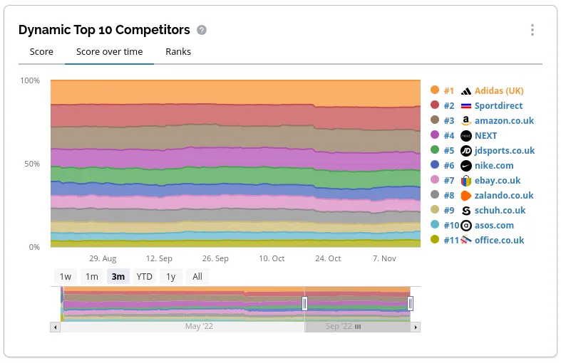
Dynamic Competitor Score Over Time
This chart shows your competitors' relative dominance of the SERP over time for the keywords in the current filtering. Apply any filter or segment to see your competitors over time for that segment!
Competitors
This chart displays your and your competitors' relative size in three dimensions.
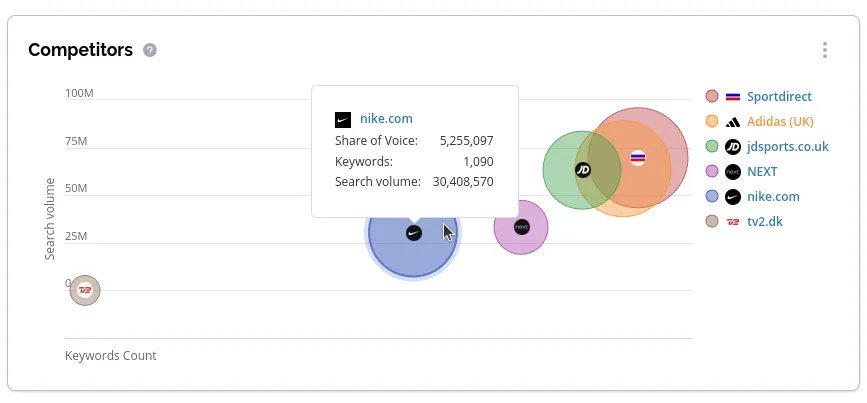
- The keyword count on the x-axis shows the number of keywords in the current filtering where the domain is in the top 100.
- The search volume on the y-axis shows the total search volume for keywords where the domain is in the top 100.
- The size of the bubbles indicates the Share of Voice for the domain.
Hover over the bubbles to see the exact numbers. Click and drag to zoom. Toggle a competitor on/off by clicking the competitor to the right.
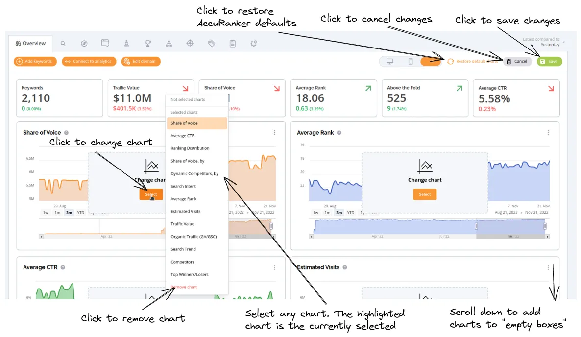
Customizing Your Overview
With AccuRanker’s new overview, we introduce the option to customize which charts are shown. We do not show all charts by default, so if you want to see your Average CTR, Estimated Visits, or Traffic Value over time, then you must customize your view. To enter “Edit mode”, simply click the top right corner:
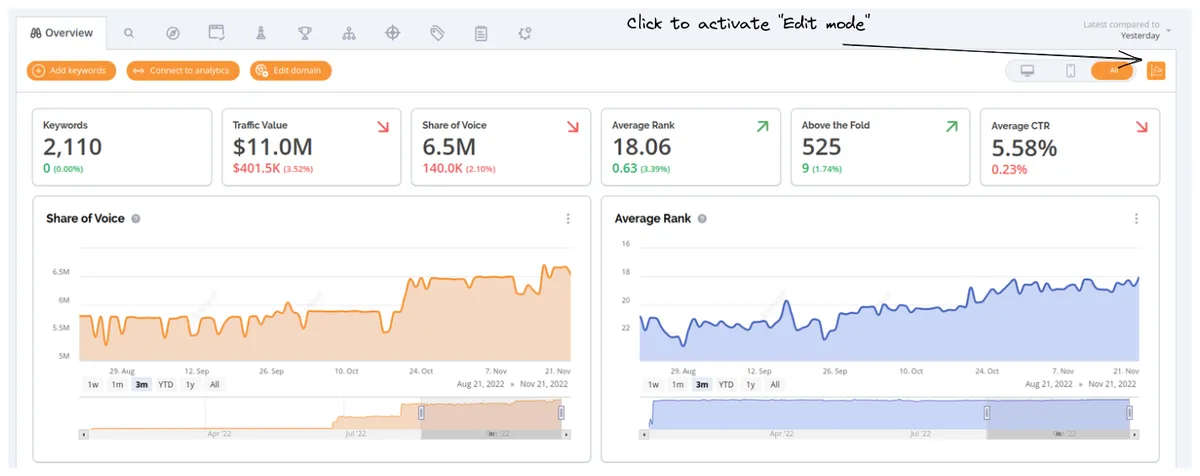
Then, the following picture shows your options:
Wrapping up
This article presented the main innovations of the new overview page - the result of months of work behind the scene.
Do not hesitate to reach out to our support team with any feedback and questions!
Related blog posts
Introducing AccuRanker’s Unified Filtering Experience
AccuRanker's unified filtering experience brings the filter bar, dynamic tags, saved segments, and the API into a shared filtering engine.
9 June 2026
Why Your CTR Model Is Betraying You
A static CTR model relies on fixed averages. AccuRanker's dynamic CTR model accounts for 120+ factors to calculate a keyword's expected CTR.
2 June 2026
AccuRanker Launches App in ChatGPT
AccuRanker Search Intelligence is our official app in ChatGPT. It enables you to chat with your AccuRanker or AccuLLM data inside the LLM.
27 May 2026